Tutorial outline
Caitlin Simopoulos
The overall goal for this tutorial is to analyze real metaproteomic microbiome data in R. However, specific goals are:
- Understanding how metaproteomic data is acquired
- Complete exploratory data analysis on metaproteomic microbiome data using PCA
- Complete statistical analysis on metaproteomic microbiome data by PLS-DA
By the end of this tutorial you will learn:
- How metaproteomic data is acquired (briefly)
- How to preprocess data
- A quick quality control check
- What PCA is and how to complete it in R using
prcomp - How to visualize "big data"
1. Understanding metaproteomic data
Like we talked about in our first week together, our lab studies the gut microbiome using metaproteomics. As computational biologists, it is essential to understand where the data comes from in order to analyze it properly. Let's quickly go over how we get our metaproteomic data before we take a dive into data analysis.
Mass spectrometers are instruments that measure the mass-to-charge ratio (m/z) of a molecule.We can use this information to calculate the exact mass of the molecule, and therefore can identify that molecule from a theoretical database. We also use retention time (how long the molecule took to run through a liquid chromotography column) to identify the molecule. Thus, we use bioinformatics to identify a molecule by matching their "features" to features of known molecules.
Like the word metaproteomics suggests, we are studying proteins. However, proteins are just too large to be measured by an MS. We first have to cut them enzymatically into smaller peptides.
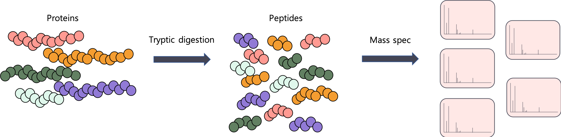
Proteins -> peptides.
Using the MS, we can also measure the intensity of a peptide. This is a proxy for abundance. You can think of intensity like it's "gene expression level". The higher the intensity, the more expressed this peptide is and vice versa.
But peptides aren't proteins!
The problem is that we're not actually interested in peptides, are we? We are interested in entire gene products - proteins. And because we use an enzyme (usually trypsin) to cut up our proteins, we are going to be identifying a lot of peptides that actually belong to multiple proteins.
Here's a quick example. Trypsin cuts at K and R.

Proteins -> peptides.
Check out the peptides outlined in black below. Trypsin cuts them at the exact same position, so we can't match them back to a parent protein.

We can't always match peptides back to a parent protein.
How MetaLab identifies proteins
We are going to be using the output from MetaLab for our analysis. MetaLab is a metaproteomic pipeline written by the Figeys lab. MetaLab uses another software, MaxQuant to complete a peptide database search and identify proteins from peptides.
MaxQuant quantifies proteins using "protein groups". Let's say we identified peptides that are found in two different proteins and we have not identified a peptide that only belongs to one of those proteins (a unique peptide). Those two proteins will be grouped together (into a protein group) and will be quantified together.
Today we will be analyzing protein-group data from a microbiome metaproteomic experiment.
Three samples are control samples. These will be labeled PBS1, PBS2, PBS3.
Three samples are treated with 1-kestose, a prebiotic. These will be labeled KES1, KES2, KES3.
Before we start...
Let's discuss our hypotheses.
- What is 1-kestose? Hint: It is a component of fructooligosaccharides
- What is a prebiotic?
- What do you think will happen to a microbiome that is treated with a prebiotic?
2. Loading our microbiome data
MetaLab outputs a lot of files for us. Today we're only interested in one file: proteinGroups.txt. We're going to learn how in read in a file into R that we've saved on our computer. We can use functions like read.csv() and read.table(). We're going to use read.table() because our file is NOT a CSV.
Discussion question: What is a CSV?
## let's assign data the name "df".
## this file is pretty big so it might take a couple seconds!

df <- read.table(file="https://caitlinsimopoulos.com/media/proteinGroups.txt", header=TRUE, sep="\t")
## header=TRUE tells R that the first row contains column names
## sep = "\t" tells R that our file has columns separated with tabs.

colnames(df)
Yikes...There is a lot of information in this file. Some might say too much for right now....
While all of this information is useful, we are going to focus on protein quantification. We will be using "MaxLFQ" as our quantification method. For the sake of time for this tutorial, we won't be getting into HOW this is calculated, but you can read about it here. Briefly, MaxLFQ quantifies protein groups and can be used to describe protein expression.
We want to use select() to grab columns of interest. We're interested in all the columns that start with "LFQ.intensity". Good thing there is a function for this: starts_with.
We're also introducing the %>% pipe. %>% can be interpreted as a link from one result to the next. We use it when we want to link multiple functions together in a single line.
df <- read.table(file="https://caitlinsimopoulos.com/media/proteinGroups.txt", header=TRUE, sep="\t") maxlfq <- df %>% dplyr::select(Protein.IDs, starts_with("LFQ.intensity."))
# here we take df "and then" select colums "Protein.IDs" and columns that
# "start with" LFQ.intensity.
head(maxlfq)Hint: use the arrows to scroll to see the other columns
3. Quality control check up
We should probably do a quick quality control check up of our data to make sure there aren't any technical issues (eg. issues introduced by the mass spec). There are a lot of different types of types of quality control we can do, but I chose two that can be visualized using ggplot2. In general, we want to make sure that all samples have relatively similar attributes. We expect samples to be more similar than they are different. Today we're going to look at:
- Protein group intensity distributions across all samples
- How many missing values there are across all samples.
Log2 abundance boxplots
First we want to look at the mean abundances of proteins across all samples. While we expect that specific protein gene expression will change when the microbiome is treated with kestose, there shouldn't be much difference when we consider all identified proteins. If there is, there may be a technical issue where we are measuring too much or too little of the protein. We can fix this with "normalization", but we have to identify the problem first.
## all exercised rely on this code
df <- read.table(file="https://caitlinsimopoulos.com/media/proteinGroups.txt", header=TRUE, sep="\t")
maxlfq <- df %>% dplyr::select(Protein.IDs, starts_with("LFQ.intensity."))
log_maxlfq <- maxlfq %>% dplyr::select(-Protein.IDs)
log_maxlfq <- log2(log_maxlfq+1)
log_maxlfq$protein_id <- c(1:nrow(log_maxlfq))
log_maxlfq_long <- log_maxlfq %>% pivot_longer(!protein_id, names_to="Samples", values_to="log2_MaxLFQ")
missing_values <- log_maxlfq_long %>%
        mutate(is.missing = log2_MaxLFQ == 0) %>%
        ## check to see which are missing. If they are missing, we'll see a "TRUE
        group_by(Samples, is.missing) %>%
    summarise(count = n())
missing_percent <- missing_values %>%
        mutate(Percent = count/nrow(log_maxlfq)*100)
swapped_log_maxlfq <- log_maxlfq %>% select(-protein_id) %>% t()
Before we plot the data to make sure everything looks ok, we need to transform the data by log2. We log transform data to reduce the contribution that really highly or lowly abundant proteins might have on any statistical analyses we may do. We can choose any base for logging the data, but biologists often choose 2 because it is more "interpretable", but it is really up to the researcher.
R has a built in command for log2: log2. We want to log all the columns in our maxlfq data frame other than the Protein.IDs column. We can use select to ignore a column. Check out how we'd do this:
log_maxlfq <- maxlfq %>% dplyr::select(-Protein.IDs)
log_maxlfq <- log2(log_maxlfq+1)
# pay attention to how we can use %>% to link multiple functions together
head(log_maxlfq)
Once we link the data, it's time to plot! Let's think back to our ggplot tutorial. We have to tell ggplot the x and y axis...but our data isn't set up like this. We have a lot of columns and we need to plot all at once. In otherwords, we have wide data right now, but we need long data.
Humans love wide data. Just think of how we would set up any table. It makes sense to humans. Computers prefer long data. It's easier to store. I like to use pivot_longer() to change my data from wide to long. (Check out the documentation.)
PS You can also use pivot_wider() to turn your data frames back into a more human-friendly format!
colnames(log_maxlfq)
# we actually want to include a column that represents our protein IDs. we can just include a number
# that we can reference back to if we want
# for example, "1" will mean the first protein group (the first row), "2", will mean the 2nd, etc
log_maxlfq$protein_id <- c(1:nrow(log_maxlfq))
log_maxlfq_long <- log_maxlfq %>% pivot_longer(!protein_id, names_to="Samples", values_to="log2_MaxLFQ")
## we're telling pivot_longer to keep "protein_id". We'll need this in the future.
head(log_maxlfq_long)
Once we're in "long format", we can plot our data using the methods we learned last tutorial.
(mean_abundance <- ggplot(log_maxlfq_long, aes(x = Samples, y=log2_MaxLFQ)) +
        geom_boxplot())
#let's keep it simple for now and keep this plot "boring" looking, but feel free to add colour to spice it up
OK, this is normal! It looks like each sample is relatively similar and there are no "obvious" outliers!
But check out the points at the bottom... what are those?
Let's dicuss.
Missing values
Another important thing to check is the number of missing values. Because of how mass spec data is acquired, it is "common" to encounter many missing values (represented as 0s or NAs in our data). However, missing values make it difficult to complete data analysis, and an excess of missing values in a sample may indicate that something went wrong. Therefore, we should check how many missing values each sample has to make sure that all our samples look "good".
missing_values <- log_maxlfq_long %>%
        mutate(is.missing = log2_MaxLFQ == 0) %>%
        ## check to see which are missing. If they are missing, we'll see a "TRUE
        group_by(Samples, is.missing) %>% ##
        summarise(count = n())
## this means we are counting the number of times a protein is missing or NOT missing in each Sample

missing_values

## let's transform these into percentages

missing_percent <- missing_values %>%
        mutate(Percent = count/nrow(log_maxlfq)*100)
        # creating a column that is the total # of proteins for calculating percentages
missing_percent
Now that we've counted how many missing values there are, we can plot it using ggplot() to see if there are any samples with more missing values than the others!
Let's plot the percentage of missing values. To do that, we'll calculate the percentage of missing AND present values, and then create a data frame to store it in.
(percentage.plot <- ggplot(missing_percent, aes(x=Samples, y=Percent,fill = is.missing)) +
         geom_bar(stat = 'identity') +
        coord_flip()  + #makes it a horizontal bar chart
        scale_fill_manual(name = "", # this removes the legend name
                        values = c('steelblue', 'tomato3'),
                        labels = c("Present", "Missing")))
4. Exploratory data analysis
Principal component analysis (PCA) is another type of analysis that is used to test quality control, and is very common in "-omics" data (such as genomics, transcriptomics, proteomics, etc). Typically we use PCA to visualize data that is very high dimensional (lots of samples and proteins). This way we can identify outlier samples that may have problems due to technical issues.
There isn't enough time to go into what PCA does, but here is a link to a visual explanation.
In our case, we will expect that control samples will be similar to each other, and samples treated with 1-kestose will be similar to each other.
swapped_log_maxlfq <- log_maxlfq %>% select(-protein_id) %>% t()
metadata <- data.frame(Treatment = c("KES", "KES", "KES", "PBS", "PBS", "PBS"))

autoplot(prcomp(swapped_log_maxlfq), data = metadata, colour = 'Treatment')
What is this PCA plot telling us about our data? Let's discuss.
5. Further analysis
There is more data analysis that we can do, but there wasn't enough time to show it all.
For example, we can look into the taxonomy of the samples and test how 1-kestose may alter the composition of the gut microbiota. Or, we can look into how the microbiome changes functionally with different treatments. We can see how specific proteins/peptides change expression by looking at the "fold change" values of PBS vs KES samples.
Hopefully this shows you a bit about what we can do in R and how powerful and fun it can be!